The Albany Boutique Hotel
A new brand and repositioning for a boutique hotel in St Andrews, Scotland
Project
The Albany Boutique Hotel sits in the heart of St Andrews, one of Scotland’s most loved towns. It’s home to a world-famous university, ancient cathedral ruins and is the spiritual home of golf. When the hotel’s new owners, two brothers with a deep and personal connection to the game, invested in a full transformation of the property, they needed a brand to match their ambition.
The Albany was moving upmarket. The interiors were being reimagined from the ground up in collaboration with Brightscale, a London-based interior and architectural design agency. We were brought in to ensure the brand told the same story the hotel interior was beginning to tell; one of quality, character and a genuine sense of place.

Our Approach
Every project we take on starts with the same question: what’s the real story and how can we tell it?
The Albany Boutique Hotel Story
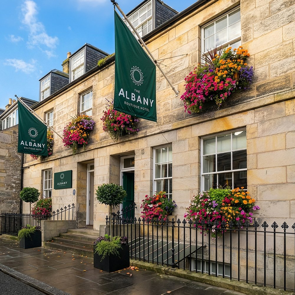
At The Albany, the answer was compelling. A Georgian building dating to c.1764. A location steeped in history and alive with visitors: golfers, tourists, families of students at one of the UK’s most prestigious universities. And at the heart of it all, two brothers whose family story has strong ties to golf and Scotland.
Our job wasn’t to invent a personality. It was to represent a great offer and give it a visual language worthy of the place.

The Identity
Symbol
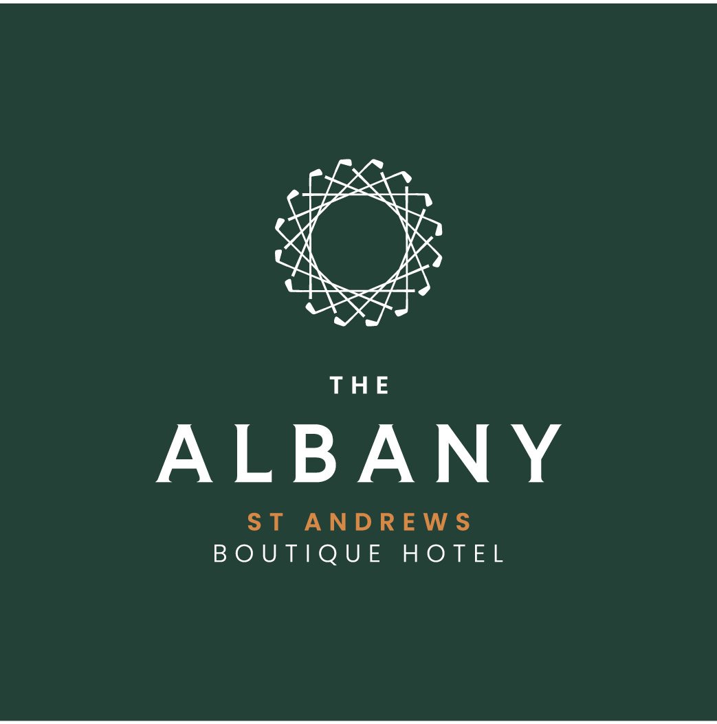
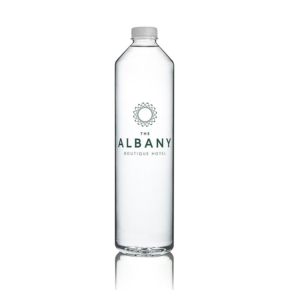
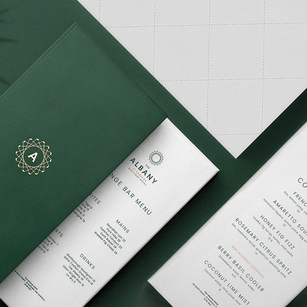
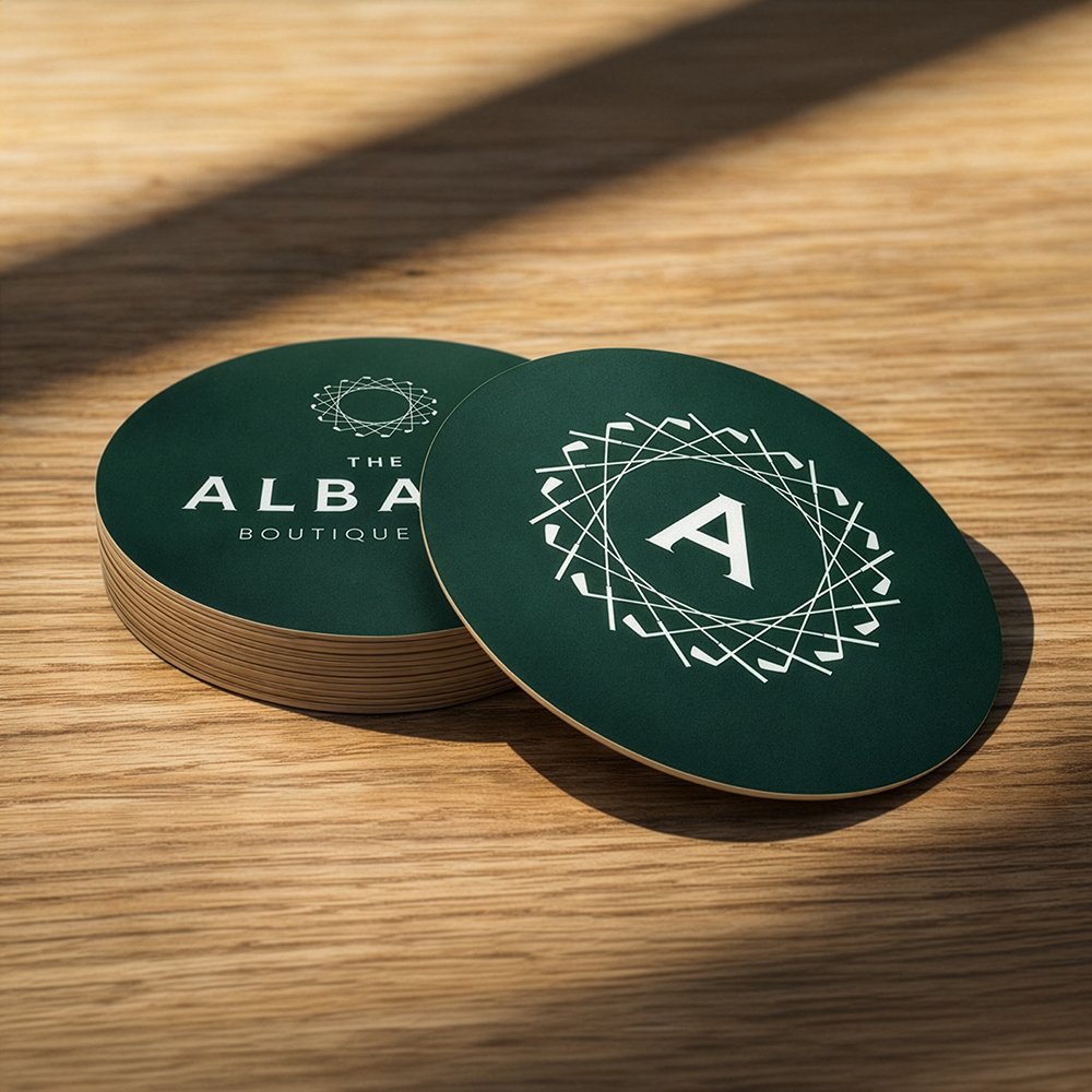
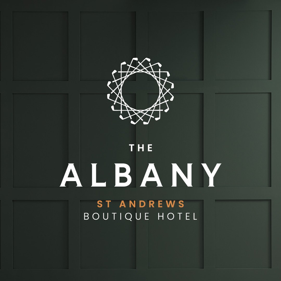
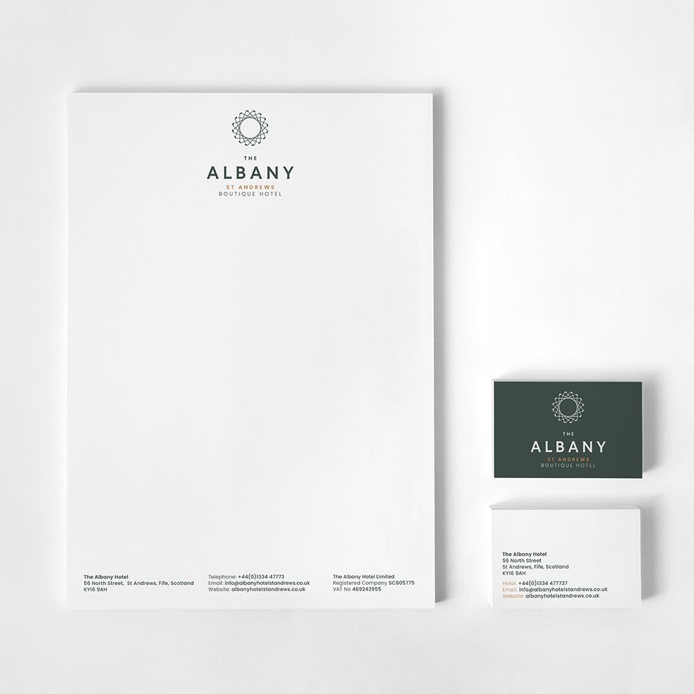
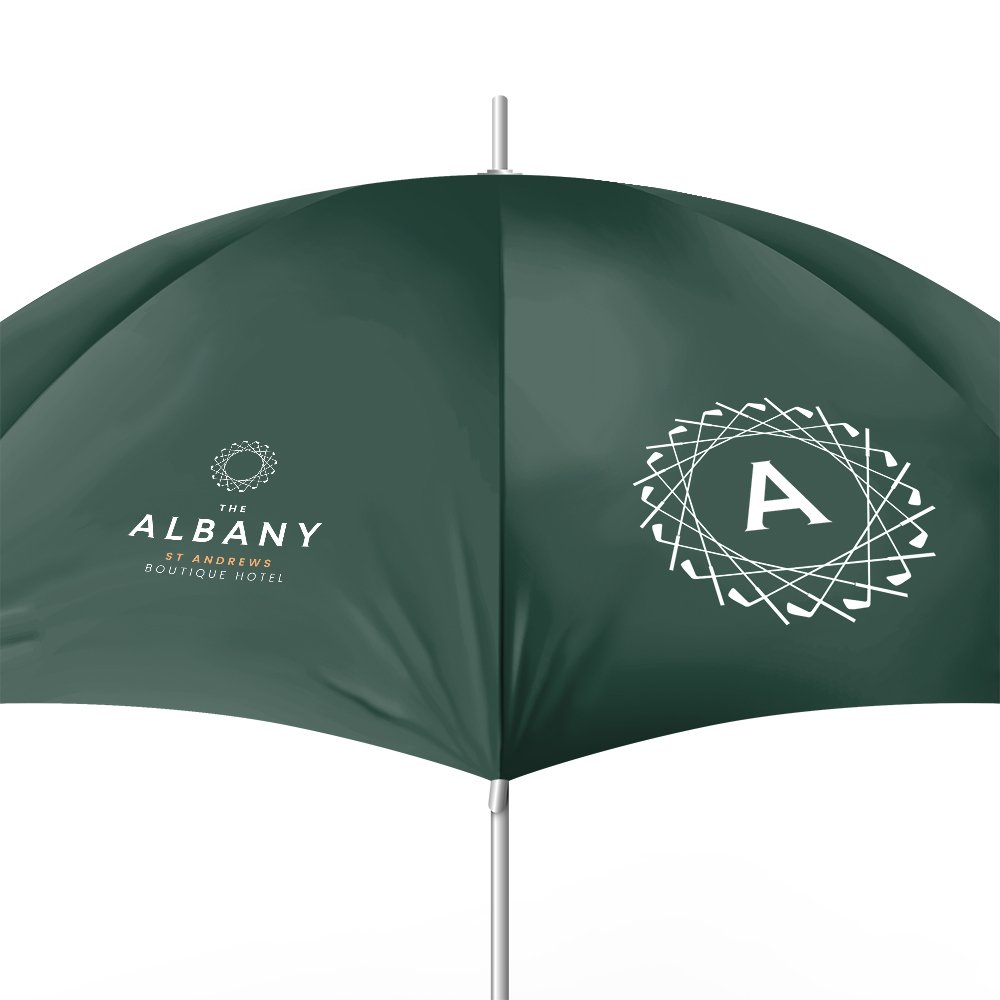
At the heart of the brand we designed a roundel formed from golf clubs. The symbol that represents the owners’ family heritage and gives a nod the hotel location in St Andrews. We wanted it to be distinctive without being decorative for its own sake.
Typography
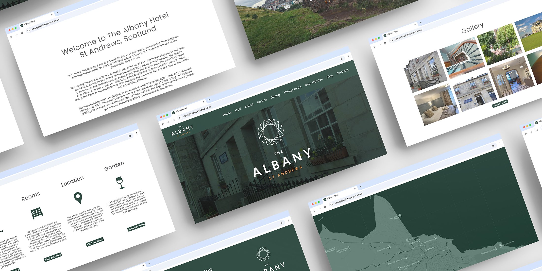
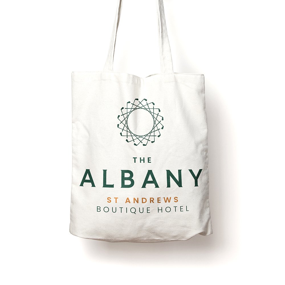
Our choice for type was to pair a bespoke semi-serif with a clean sans-serif typeface, giving the brand a classical confidence. We wanted to ensure that the logo remains legible across every application; from signage on the building façade and printed menus to key cards, the hotel website and across social media.
Colour
The colour palette is inspired by the local landscape: deep greens evoking Scotland’s open spaces and golfing heritage, lifted by warmer accent tones. Developed in close collaboration with Brightscale, our choice of colour ensures the brand and the interior feel like two expressions of the same idea; cohesive, considered and unmistakably The Albany.



Results
The Albany Boutique Hotel brand is rolling out across the hotel in phases, in step with the wider refurbishment. Early signs are encouraging: bookings are up, guest feedback has been positive, and the owners are pleased with what they’re seeing.
In their words: “Working with Simpkin Burley has been a pleasure and we’re really pleased with the results we’re starting to see.”
Project Team
Interior Design and Architecture: Brightscale
Brand Design: Simpkin Burley
London City Airport
A B2B marketing campaign for London City Airport’s terminal for the future

Project
We created a B2B campaign creative for London City Airport’s terminal for the future. The airport wanted a way of promoting their new retail and leisure space to potential tenants to give a true sense of what to expect. The campaign features contemporary London design because, like the forthcoming terminal, this reflects the essence of the city.
Bold infographics, famous London quotes and a strong sense of storytelling enabled London City Airport Group to convey complex information. This enabled the business to market their offer to potential partners and enhance their brand.


B2B Marketing for Property
Customer Journey
Selling tenant space within a built environment is an area of expertise for us at Simpkin Burley. The London City Airport B2B marketing campaign walks potential tenants through the tender process in an easy-to-understand way. This was designed to increase the number of applicants for space and lead to better quality tenants.
Build Environment Specialists
Our team has over twenty years’ experience in designing marketing material to sell property together with understanding the customer journey of the built environment industry.

Manchester Airport Group
Creative partner, designing marketing and advertising campaigns for Manchester and Stansted International Airports

Project
Simpkin Burley is a Manchester and Stansted International Airport creative partner to Manchester Airport Group (MAG). As well as ‘in-house’ campaigns we have also supplied creative for international travel brands such as Virgin Holidays and Singapore Airlines.
Working alongside MAG’s marketing team, we have created marketing and advertising campaigns, informational designs, promotion for their services and facilities, including large scale signage and wayfinding.
Manchester Airport T3 Wall
Large Scale Infographic
At Manchester Airport we used the existing Manchester Airport brand in a fresh and bold way to create an information corridor to promote their pre-flight services. We divided a 24 metres terminal wall into individual ‘fly poster’ designs, creating visuals and messaging that spoke to people on the move.
Design Impact on the Move
We combined striking imagery with simple statements that could easily be digested while walking. By taking this design approach, we were able to communicate a lot of information in a concise way.


Destinations Campaign
Promotion
To raise awareness of the many routes offered by Manchester International Airport, Simpkin Burley designed a versatile flyer. The design concept was influenced by an airport departures board.
Event Marketing Collateral
The flyer was designed to be updated and could be given different colour treatments to tie in with events that the airport attended as a business. The flyer was used at a several off-site events like Manchester Pride and events to promote their routes and services.

Price Guarantee Mark
A Mark of Quality
To promote food and beverage (F&B) tenants within their terminals, Manchester Airport engaged Simpkin Burley to design a price guarantee mark. The mark signified that operators of restaurants and bars were pricing competitively with the high street. The campaign aimed to dispel the myth that airports’ operators heavily mark up their food and beverages.
A Complementary Brand
The mark was designed to sit with Manchester Airports F&B tenants’ brands. This meant considering versatility, shape, size and end-user applications.

Creative Partner
Brand Guardians
With a working relationship dating back years, Simpkin Burley’s mission has always been to contribute to the strength and clarity of the Manchester Airport Group brand. Working with the company’s existing corporate identity, we consider ourselves responsible for the presentation of MAG’s brand in a consistent and creative way. We aim to tell their story and enable them to communicate clearly.
Support for Business
Working behind the scenes we have also worked on business presentations and tender support to ensure that Manchester Airport Group’s business runs smoothly and profitably. We also provide on-hand support for some of their airline and F&B partners.
